Website Prototype

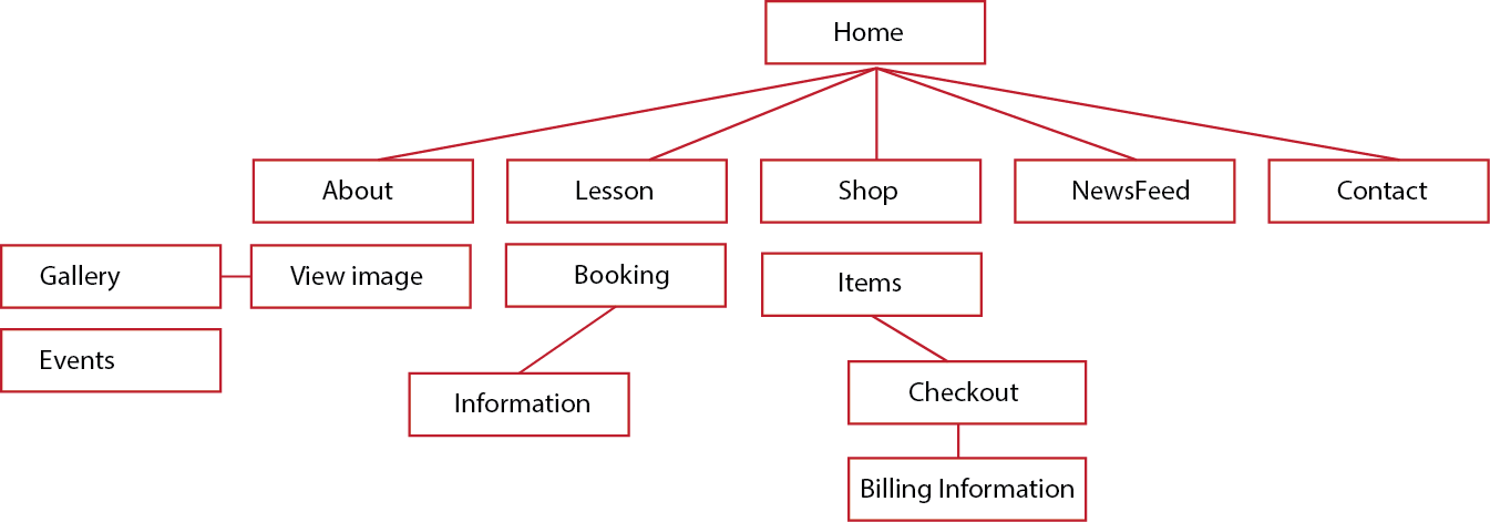
After getting the concepts right into place Then I were able to continue onto the prototyping phase where I used MockinBot, and I’ve chose to use this because it’s a simple tools to learn and easy to understand. Mocking the website up on here is easy and straight forward but it wont let me use costume fonts and because of this I wasn’t able to use the Fairplay Display so I have to use the basic font within the tool.

Keep in mind that the colour scheme and structure may be change in the final stage of the design.

https://mockingbot.com/app/56aadbd66ced94936bf98c84ebdbc2aaa2444fd7/embed

Shopping Page

This is the shopping page where it display bohdran for sales and other relevant products, I structured it like this because i want the users to have a clear look at the product without having to click on in individual one I have also included a multiple thumbnail for each of the product so that the users can explore the product better. The quality of the bohdran are indicate by the colour, yellow mean average, red mean poor, blue mean good and Purple-ish mean excellent.

shoppage

About Aimee Page

This is the about page, this page is basically her biography in a appealing way rather than text, and it may seem long but it’s not bad because the users does not mind scrolling.

this page aim to tell the story of Aimee how she became who she is today, What educations does she have, and where does she play and etc..
This page is to prove to her users and new users that she is not just any ordinary Bodhran musician. She is a professional with experiences.

AboutPage

Homepage Concept Finalize – May Need Adjustment

HomepageConcept

The main purpose of this homepage is to distribute her services nice and clearly so that her Costumers can spot them when they first arrive to the page. The navigation will be fixed position so that the users can travel through the website at any time they wishes without have to scroll up and down.

I believe this design is very clean and modern looking and according to the client she want to stay away from the Irish feel and look and wanted to have the modern approach with a clear and easy to see call to action.
The big video is going to be a video playing in the background while the users can still be able to read the description about Aimee and if they wishes to read more they can enter the inner page for more information.

Font style for the headline are Playfair Display along with Open Sans for the body text because I want something light and easy to read,  the playfair is already strong comparing to open sans so I don’t want to draw to much attention to body text because the headline already done that.

Homepage Structure

I believe homepage is the page that will attract the users the most, if the users can’t see who or what you do within 20 second it will be a failure and they will lose interest, users only come to a website for only  one purpose and that is to see what they came for.

homepage

If the users can’t see what you’re doing then you must scrap the design straight away, reason why I have texts lay on top of the image/video because I want the users to know who is Aimee and what she’s doing and once they scroll below it show services straight to them without losing their interest.

And the reason I chosen this colour because I want to have a strong accent colour that will work throughout the website for call to action and to highlight certain part of the website.

Creating a website is like a wearing a suit everything have to be match and in place, because if your use the cap for the first letter of the headline then it need to be like that through the rest of the site, and if you have it full cap then every headline should be in cap.

Section Divide

servicesS

There are going to be two main services that Aimee will be doing, selling her lesson and selling bohdran. I have included these on the homepage because it’s easy for her users to access and if they want to see more, they can click on the call to action below. each of the part on her page are divided by a headline with a different colour to differentiate the different between each section.

Paper Concept

These concept base on the information that I have gathered, as you can see it look more imagery rather than texts heavy, I chose to use this for Aimee website because I feel that it’s important for the website to look appealing and get the information right across without having the users to search through your website.

This way it can attract them and give their attention toward the website more than a website that just have text and boring colour scheme.  the homepage lead the users to the services straight away because you do not want them to wondering around the website searching for your services, they need see it within 20 second otherwise they will lose their interest. that’s why I have the services go straight in after the slider.

.20160112_163956  20160112_163921  20160112_163945

Flow Chart

flowchart

This is rough sample navigation of the website, these will be suggest to change in the final production. the purpose of this flow chart is to demonstrate the path that the users took to get to their destination without having too much problems. the structure might be difficult to understand as I need to do users testing before coming back to it.

Chosen WordPress Theme

There are millions of wordpress theme exist out there, but finding the one that is flexible and and have a lot of feature is quite different, each theme offer different style in term of design and costume CSS,PHP and Javascript. I have to go through and explore to see which theme will be suitable for Aimee website, there are few that I have in mind, they are, Divi, Salient Theme,Big stream and etc.. all of these theme are full responsive and share very similar trace.

The reason I have picked these kind of theme because it style are very pictorial. But the more I look at the better insight I gain with them. In fairness all of these offered great customization . But the one that shine out to me is the salient theme, I love how neat the design is and how clean and clear it is, not only that but it also Included a e-commerce style along with features, like you can overwrite the original CSS with the costume CSS that you have.