Woo-Commerce Elements

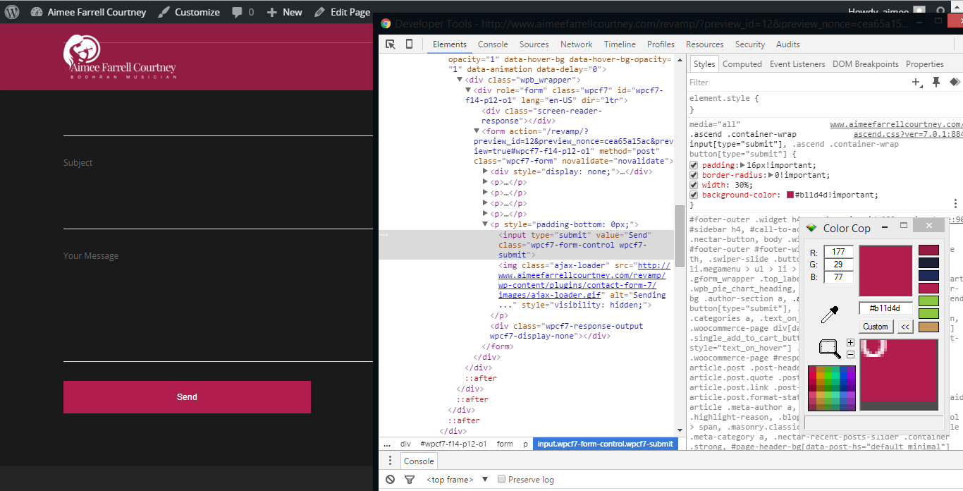
The add item button on the shopping page is not visible and does not fit into the brand that well so I have decided to change it around by using the inspect elements and add in elements. then bring it into the theme CSS.

woocommerce2

I wanted to create something that is more visible to the users eyes and it is easy for them to spot that they can buy the product by increasing the width to 100% and give the border a radius of 20 for the top.

woocommerce

Testimonials For Homepage

I believe having a testimonials on the homepage does make a big impact on how the users will think of your services and products. it give the users more trust toward your brand.

This testimonials style is different from the average testimonials where you only see a big line of text.This one created the effect of the person speaking through the speech bubble.

testimonials

Booking Form

Having a bit of trouble trying to understand the booking form format and how it work. I have try and insert it into the website but it does not go full width and contents are flying all over the place. I think it could be the theme compatibility issues. but I will look more into the setting areas and the back end of it to see how it goes.

booking


booking2

Changing CSS With Salient

To me this is the most efficient way of changing and adding custom CSS to overwrite the original. for example in this part i want to change the send background color. I inspect it element then look for the button CSS and added in the CSS that I wanted it to be and change the Color to match with the accent colour. it does not show up so i added in the !important which force the CSS to be top priority. But using this too much can cause the website to be hard to change in the future.

ChangingCSS

After confirmed on the CSS that I wanted I copy and paste the codes into the salient theme back end where I can add in my own custom CSS.

ChangingCSS2


Building Website

The website is come together nicely, without any trouble yet. but there seems to be few padding mistaken.

The split screen style is a bit hard to achieve as i need to create two column and set the two column to full contents width and because of this the contents are pushing right into the edge of the website. so within each of the column, I need to give it a fix % padding.  at first it was 5% but that does’t match with the rest of the website so I give it a 7% and its perfect. the 7% pushed all angle of the column.


Before

BuildingPre


AFTER

Building

Homepage Ver 2

During our meeting the client suggested that i should lightening up the logo on the website more, because it seem hidden on the top left of the screen and this is due to it being on top of an dark overlay.

So I have to bring the logo to pop out by using a brighter colour for the logo and darker background.

HomepageVer2